The Samsung Galaxy Nexus

2012 01 11 18 34 38

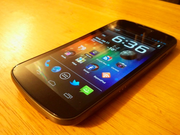
I've talked about how the Galaxy S demonstrates the problem with Android.  During that time I also talked about how I was considering voting with my dollars and moving over to a nexus phone, specifically the new Samsung Galaxy Nexus.  I'm happy to say I did just that a couple weeks ago, and I want to talk about it.

2012 01 11 18 36 12

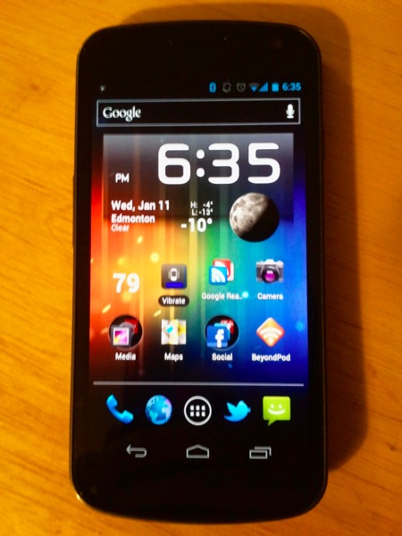
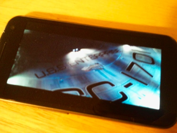
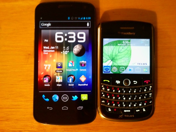
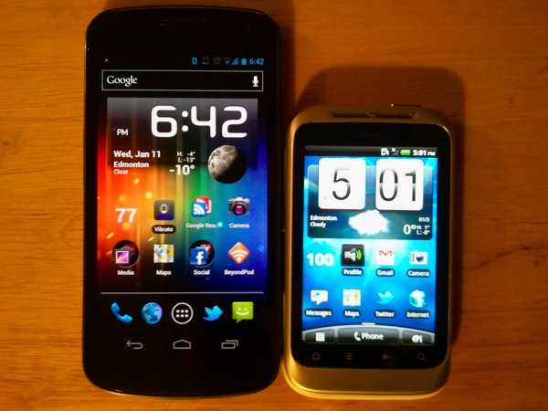
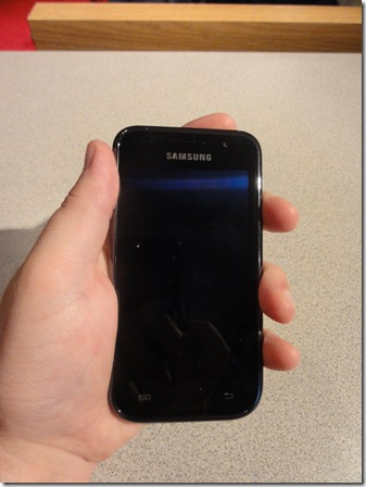
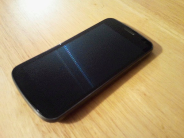
My biggest fear on the Galaxy Nexus was that it was going to be too big for my liking, considering the screen is a massive 4.65". While i will say that I definitely would not want a phone any bigger than this, I don't mind the size, and am getting used to having a bigger phone.  The phone itself is actually only slightly bigger than a 4.3" phone like the HTC Sensation, mainly because it does not need to have the row of buttons.  Not having the buttons also leads to one of the truly unique experiences about this phone, which is the fact that the front is dominated by the screen, easily 85-90% of the front panel is just screen, with no distractions.

2012 01 11 18 35 57

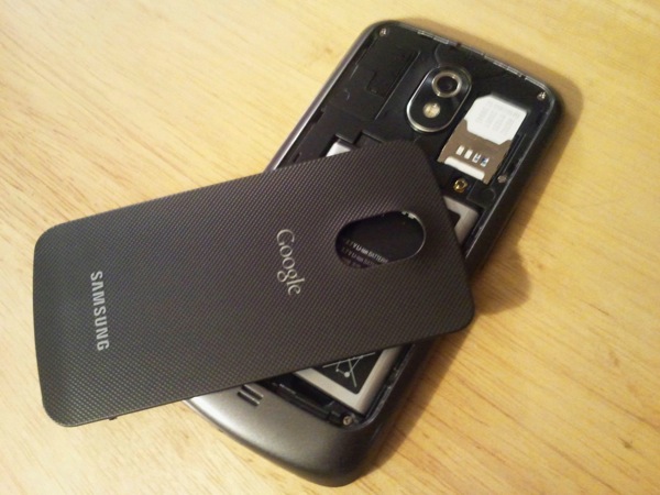
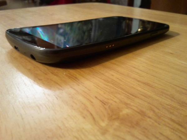
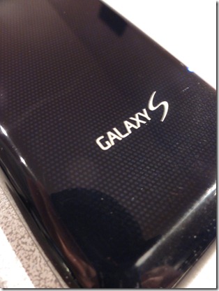
The phone itself has a plastic casing.  that doesn't make it cheap.  In fact compared to the Galaxy S the Galaxy Nexus feels amazing. The Galaxy S feels cheap and plasticey compared to the Galaxy Nexus, which feels like it is well constructed and can actually handle every day wear and tear.  It also includes that crazy battery cover which is very thin, very flexible, but doesn't feel like it would break, and has a textured back.  It is also extremely difficult to put on the phone, which is annoying.  I do wish the phone was made with more metal in the body to make it a bit more durable, but it definitely does not feel cheap.

2012 01 11 19 26 37

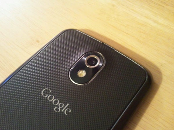
The phone also has a 5 megapixel camera with an LED flash. I really welcome the LED flash, as the Galaxy Nexus didn't' have one.  The flash won't blow anyone away, and in some situations it doesn't help, but I'd rather have a mediocre flash that I can use sometimes than no flash at all.  The camera itself is admittedly a bit of a mixed bag.  In good lighting and outdoors it produces excellent results. Indoors and in darker environments it is not as good as I would like.  I'll I've with it, but I do with the camera shot better photos.  Note that while the camera software includes a "zero shutter lag" ability, where tapping the shutter takes a picture almost instantly, I've found that that tends to produce the worst pictures, and the tried and true method of actually taking the time to line up a shot and focus properly obviously takes the best pictures.  The zero shutter lag ability is nice, and I used it to grab some great shots of an indoor fireworks show, but it is not something that can and should be relied upon for good pictures.

2012 01 11 18 35 09

I do have a few complaints about the hardware, however.  The first is the Camera, which I've already talked about. A quality 8MP camera would have really made a big difference in this phone.  The built in speaker is also a sore spot.  Frankly, it is not loud enough.  It does the job in most situations, but I find the alarm clock to be too quiet, and it is nowhere near as loud as the Galaxy S. It is not a deal breaker, but it definitely could be louder.  The location of it also bugs me.  On the Galaxy Nexus it is placed at the bottom of the phone. Maybe it's just because i've never had a phone with the speaker at the bottom, but placing it at the bottom seems wrong.  The last complaint is something that could easily be software, but the auto-brightness is way to aggressive on this phone, constantly making the screen too dark, especially in a moderately lit room.  On every other Android phone I've used this hasn't been an issue, but on the Galaxy Nexus I've had to resort to setting the brightness manually, and using a widget to change it as needed.  I'm hoping this is a bug in ICS, but no one knows for sure.  I hope it is so it can get fixed quickly.

2012 01 11 19 24 54

that's really all there is to talk about with the hardware, aside form the screen.  The phone is really built to do one thing, and one thing only, and that is to get out of the way and just run Android to the best of it's abilities.  That is what is fantastic about the front of the phone.  Not having buttons means that the front is dominated by the gorgeous 720p display and Android 4.0 Ice Cream Sandwich that runs on it.  There are no buttons at all aside from the required power and volume.  The screen and the software are the stars of the show, and the phone makes that happen.

the screen, as mentioned, is amazing.  It is a 720x1280 Super AMOLED display.  Essentially, it is a 720p HD screen in a phone.  The display itself gets to the resolution by using the PenTile technique, which arranges pixels differently than a regular display.  Without getting too technical PenTile displays can look really bad at lower resolutions, where indivutal pixels can be seen and red really stands out.  However, on a 720p display that is this small the pixels are so dense that I honestly can't tell that it is PenTile.  The display is stunning, and watching HD video on it is simply brilliant.

2012 01 11 18 37 53

Ice Cream Sandwich is the star of the show here, and I can say that it is a truly massive leap for Android.  Virtually every part of the OS was re-designed, and the results are great.  Android 4.0 feels modern, beautiful, and unique.  It is a fantastic experience.  I'm not going to detail everything, because others have much better than I have, but Android 4.0 makes the pervious version for phones, 2.3 Gingerbread, feel completely outdated.

Now, many other phones will get Ice Cream Sandwich, but the main advantage to this phone remins the fact that it is a Google Nexus phone.  This means that it is guaranteed to be the first, or among the first to receive every operating system update to Android.  there are no pre-installed applications by the carrier, and this phone is very simple to unlock the bootloeader for loading custom ROM's (if you have no idea what that means, that's ok).  Nexus phones are Google's answer to the iPhone ecosystem, and they are the only phones that are guaranteed to be kept up to date for every update to Android for at least a couple years.  Owners of phones from HTC, Samsung, Motorola and Sony cannot say the same, and even if they do get the updates, they are often months behind.  That is truly the most compelling reason to own a Nexus phone.

The previous Nexus phone, the Nexus S, which is receiving the ICS update now, was regarded as a good phone, but not the greatest phone, the main reason to own it was that it was a Nexus phone.  the Galaxy Nexus changes that.  Not only is this a great phone if you want the pure Android experience, this is just simply a good phone.  Not once in the past 2 weeks of using it have I missed any aspect of my Galaxy S.  It is easy to see how much thought went into this phone, to marry the hardware and software in a way that is only matched by Apple and iOS.  and in many ways, Google has achieved something that not even Apple has been able to, they have built a phone devoid of physical buttons, the hardware being there only to serve the software to the user.

The Galaxy Nexus is not just a great nexus phone or a great Android phone, it is one of the best smartphones on the market today, period.  Are there phones that feel better in the hand? Yes. There are phones with better cameras for sure.  The speaker is too quiet.  However, the combination of the hardware and software puts it above any other Android phone on the market.  If you are looking to buy an Android phone right now, the Galaxy Nexus is without doubt the one to get.  the only reason not to get this phone is if you feel it is too large, or if you must have the best camera possible.  Otherwise, this is hands down the Android phone to buy in 2012.

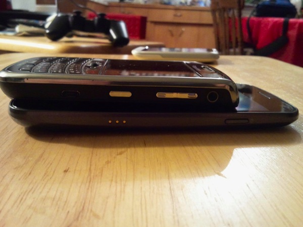
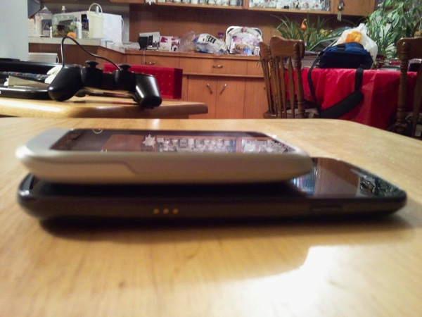
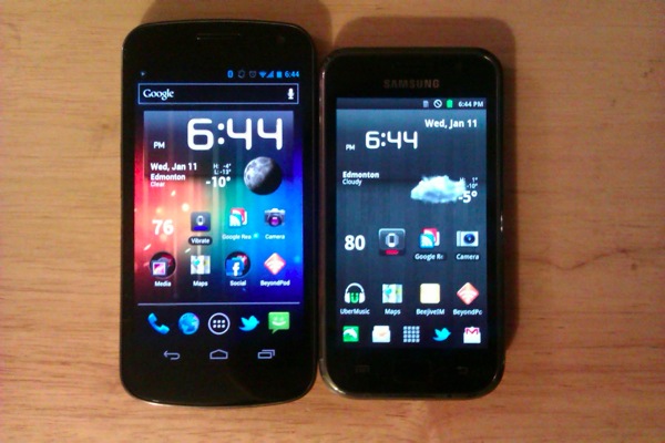
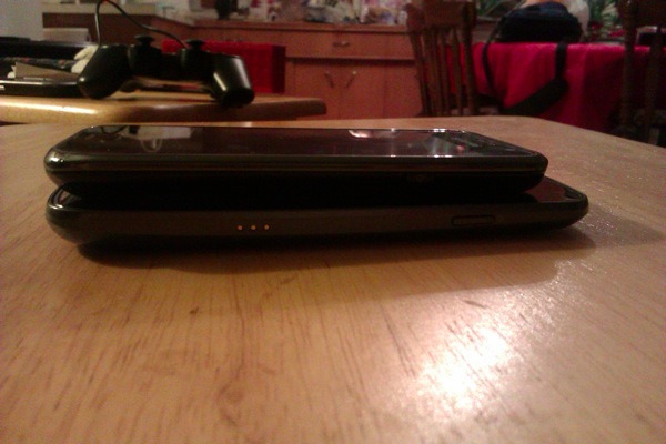
Below Are some comparison pictures to a BlackBerry Tour 9630, HTC Wildfire S, and my Galaxy S.  I apologize for some of the picture quality, as I was taking these pictures with the Galaxy S and Wildfire S.

2012 01 11 18 39 142012 01 11 18 47 282012 01 11 18 42 062012 01 11 18 46 49IMAG0058  1980 01 05 at 17 04 46IMAG0062  1980 01 05 at 17 05 53

MacBook Air Review - Mid 2011

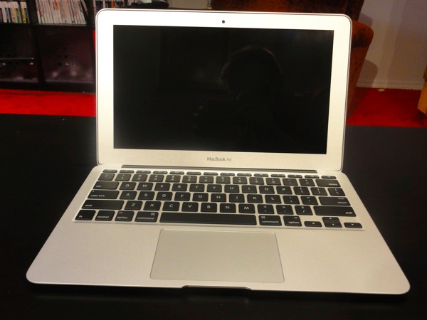
DSC03567  2011 07 29 at 16 29 14 The MacBook Air is now an interesting part of Apple's product lineup.  With the discontinuation of the White MacBook customers now have to choose between the MacBook Air and the MacBook Pro.  At the low end, the MacBook Air is $999 (though I don't recommend that model), and the MacBook Pro is $1250.  Bump up to the recommended model of the MacBook Air, and you have a $1200 11" notebook against a $1250 13 notebook.  Is the Air a better choice than the Pro? Read on and I'll give you my two cents.

Hardware

DSC03553  2011 07 28 at 16 09 34

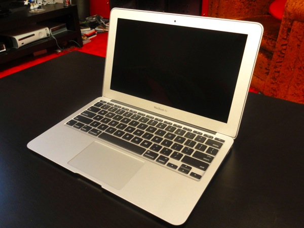
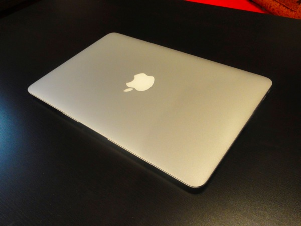
The MacBook Air is an absolutely beautiful little machine.  that's the one thing that Apple didn't change.  At first glance, the 2011 Air is exactly the same as the 2010 version.  A bit more examination shows two differences: the addition of a Thunderbolt port and a backlit keyboard.  Aside from that it is pretty much identical.  Is it perfect?  No.  The webcam (sorry, I refuse to call it a FaceTime camera) is not an HD cam like what is found in the MacBook Pro and iMac.  Perhaps the machine is just too thin to stick a HD sensor in, but it's still a little sad.  Also, while this is an 11.6" screen, the large-ish bezel around it could have easily accommodated a slightly bigger, maybe 12.1", screen with no effect on the size of the machine.  It may not sound like much, but it really is a big bezel.

DSC03551  2011 07 28 at 16 09 13

If you're looking for every connectivity option under the sun, stop right now because this machine is not for you.  On the 11" Air you will find power, 2 USB, Thunderbolt, and a headphone port.  that's it. No ethernet port at all.  There is a USB adapter for Ethernet, but then using that uses 50% of the USB ports on the machine.  I picked up an Ethernet adapter personally.  I won't need it often, maybe 2-3 times a year.  But for those 2-3 times, it will probably be a life saver.  Sure, the potential of port expansion through the Thunderbolt port exists, there is not a lot of options on this little guy.  There is an SDXC card slot on the 13" model, which is nice.  I'd like one on the 11", but there physically isn't room on the logic board for one, so I'll live.

Trackpad and Keyboard

DSC03568  2011 07 29 at 16 29 23

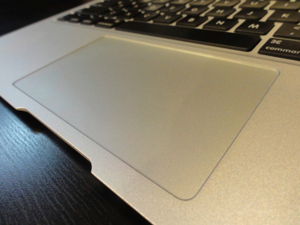
The trackpad is massive for a machine this size.  that's the one advantage of the large bezel.  It allows for a bigger palm rest and trackpad.  And with all of the multi-touch gestures now in Lion, you'll need every centimetre of it.  The trackpad itself is pretty standard for apple, but slightly smaller than found on the 13" and bigger models.

DSC03583  2011 07 29 at 16 34 21

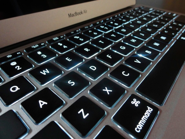
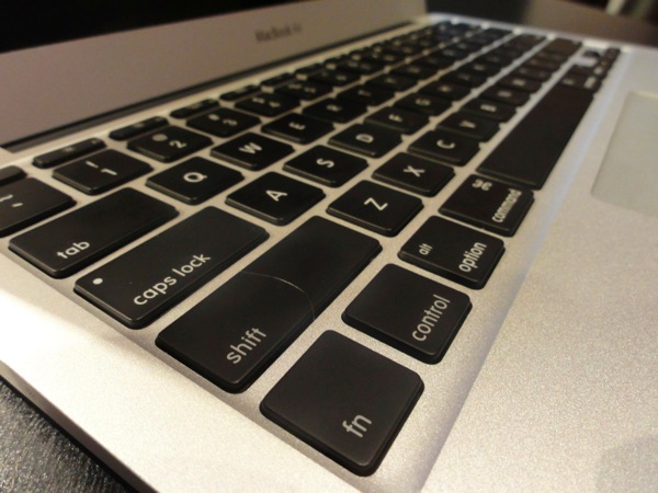
The Keyboard is also fairly standard for apple, save for a few things.  The dashboard and expose function buttons have been replaced with controls for Launchpad and Mission Control.  The actual typing experience is about 90% of what I would expect from an Apple keyboard. Where I notice a difference is in the depth of each key press.  It is another necessary evil because of how thin the machine is, but the typing experience on the MacBook Pro is slightly better because of the longer travel distance on the keys.  That doesn't mean that I don't' enjoy the MacBook Air keyboard, in fact, it's a great keyboard for the size of machine.  But the keyboard on the Pro is slightly better, emphasis on slightly.  The speakers on the Air are a bit tinny. they get the job done, but if you want to do any serious music listening or movie watching, it is best to use headphones, which sound great.

DSC03554  2011 07 28 at 16 09 40

The last thing I will say about the hardware itself is that the machine is remarkably solid, especially for a machine of this size.  That is a result of Apple's unibody construction, where the machine is basically made of 2 pieces of aluminum and the screen.  I'm not going to try it, but it really does feel like I could drop this machine and it would still work perfectly.  there is a little flex in the screen, which is understandable considering how thin it is.  But that is not enough to worry me.  The rest of the machine simply does not bend, which is perfect.

Software

Screen Shot 2011 08 01 at 9 15 09 PM

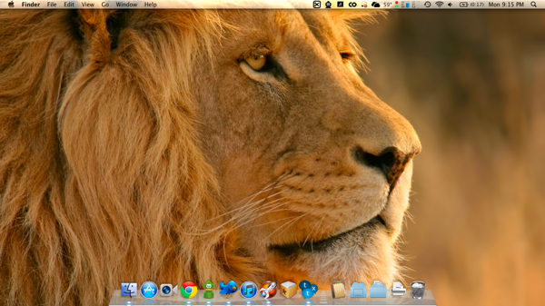
The MacBook Air, naturally, runs OS X Lion.  The experience is a little different than installing on an existing machine.  First off, Before you even get set up, it prompts you to connect to a wifi network. Then you are required to enter in an apple ID when you first boot the machine.  If you do not have one, you will have to create one.  This is the first sign of just how important the cloud is to Lion.

Past that, it actually kind of surprised me how many settings and preferences that were kept when I upgraded my MacBook Pro to Lion.  The out of the box Lion experience was vastly different than the upgrade.  Some of the multi-touch gestures were different (the Lion defaults), and even some of the interface elements were different.  I'm still going through all the settings trying to get things the way I want them, and I've found ways to fix several things that I mentioned bugged me in my review of Lion.  I plan to use this machine for a few more weeks then make another post about life with Lion.

While i'm still a bit tepid about the Mac App store, the fact that I was able to simply log in to it, and then re-download my purchased apps was really slick.  It even remembered which free apps I had downloaded, which made getting the machine up to speed, limited only by my internet connection.  I also used the iTunes home sharing feature to bring my music over form my main computer.  The last thing I did was grab all the files I wanted to keep out of the home folder from my MacBook Pro.  I actually did this using AirDrop, which was really slick, and amazingly simple.  I was able to just drag about 5 GB worth of files into the icon for my MacBook Air in the air drop GUI, on the Air I was prompted to accept the transfer, and it just stuck everything into the downloads folder, which I was then able to move to my home folder.  Apple really need to put AirDrop into iOS. I think it would be a pretty massive feature.

Performance


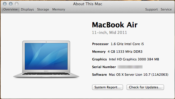
Now, I'm not going to run benchmarks and give you graphs and pie charts of how the MacBook Air performs.  Others have done that, and I don't need to.  The Air I purchased was the 11.6" version with the base 1.6 GHz Core i5 processor (which is the intel low power ULV chip), 4GB of RAM, and the upgrade to a 256GB Sold State Drive.  Every MacBook Air uses the i5's integrated graphics processor, the Intel HD 3000 graphics, which uses 384 MB of system RAM for video memory.

Now, this machine is the fastest machine I've ever used in day to day use.  This is largely because of the sold state drive, which the Air is my first experience in using one.  It goes from off to the log in screen in about 7 seconds, and after I put my password in, the desktop is loaded 3 seconds after that.  It sleeps instantly, and wakes up instantly.  Applications launch blazingly fast. I've been using the Air for about a week now, and it still amazes me how fast it is.

The processor on this machine is plenty fast as well.  Would i make it a main video editing machine? No.  But it can definitely handle itself as a video editing machine for mobile users.  my desktop runs a previous generation Core i7 920, which is still faster, but the Air is fast enough for all but the heaviest tasks I can throw at it.  It is simply not in the same universe from the ULV Core 2 Duo from the previous MacBook Air, and is significantly faster than the full speed Core 2 Duo in the 2009 MacBook Pro.

Battery life seems to be roughly what Apple claims for the 11" air, 5 hours.  I haven't run any extensive tests, but I can say that I can regularly get over 4 hours doing my normal activities (browsing, IM, Twitter client polling every few minutes, and some app use like Reeder), but not more than 5.  I wish the battery life was a bit longer, but again, on a machine this small, I will trade a bit of battery life for the size.

I didn't buy the Air to be a gaming machine, and I'm obviously not going to try running a lot of high end games, but that being said I loaded up Civilization V and it was playable at the native resolution; albeit on the low settings.  Most games that are a few years old seem to run fine (Star Wars: Empire at War was my main test case), and the Air runs Angry Birds and Plants vs. Zombies like a fiend.

My only real concern is that the Air runs a little warmer under idle conditions than I would like.  While my MacBook Pro idled at about 41-44 degrees, the MacBook Air idles about 10 degrees warmer than that, and regularly gets over 65 degrees under a moderate load.  Time will tell whether that will be an issue or not.

Wrap-up

DSC03574  2011 07 29 at 16 30 47

So the main question still remains. Can the MacBook Air be a users only computer.  For me, the answer is still no.  The MacBook Air is a fantastic computer, but I am still too much of a power user.  My Air has a 256GB hard drive, and I have 5.5 TB in my desktop.  I game on my desktop in ways that simply aren't possible on the Air.

That being said, I can see the Air being a perfectly acceptable computer for most users.  I absolutely do not recommend the $999 version though.  a 64GB SSD and 2GB of RAM are frankly unacceptable in 2011.  I think that the $1,200 model with 4GB of RAM and 128GB SSD should be the minimum users should consider.  For other things, like the ethernet port or optical drive, a simple question needs to be asked: When was the last time you used them on your laptop.  For me, I hadn't used the optical drive in over a year, and the ethernet port only 2-3 times in that year, which can easily be fixed with the USB adapter.  A USB DVD drive can also be bought for the few times when an optical drive is needed.

If you can live without having an ethernet port or a DVD drive every day, and understand that the $1200 model is the minimum that should be considered, the MacBook Air can absolutely be someone's only computer. Especially the 13" model, which offers higher specs and a slightly larger screen.  Even for me, where the 11" Air is going to be my secondary/couch/travel computer, I could not be happier with it, and it comes as highly recommended as I can.

You can see more pictures of the MacBook Air, including size comparisons to the Mid-2009 13" MacBook Pro here

The Big Cat - OS X Lion Reviewed

On July 20, 2011, Apple released the 8th major version of OS X, version 10.7 Lion.  I’m not going to spend time doing something that’s been done better in many other places.  Ars Technica has what is probably the comprehensive review of Lion; a massive document totaling about 27,000 words.  If you are looking for the definitive review, that is it.  What I’m going to talk about is my experience with Lion.  What I like, what I don’t like, and what’s changed compared to how I used Snow Leopard on a day to day basis.  Another thing I’m going to try to do is separate how I use OS X, and try to look a little more at how a novice OS X user would use it.  Many of the new features in OS X are designed for those users, and while I personally may not like them, they may make the experience better for a good number of users.

Begin!

After almost a week of using Lion, I can say that it’s a mix of good things, puzzling things, and things I frankly don’t like.  That’s not to say that it’s bad.  Lion’s goal seems to be improving the accessibility of a desktop OS, and making it easier for anyone, especially those who have use an iPad, to pick up and use.  In the process they have made things harder for long time users of OS X, and computers in general, by changing some of the fundamental things in a computer that users have been accustomed to for 20+ years.

Scrolling

Lion’s default scrolling is backwards.  That’s right, backwards.  The same way we’ve been scrolling documents, web pages, code, pictures, etc for 20 years has been turned backwards.  I tried it, I really did.  I used it for 2 days, and I frankly cannot stand it, and changed it back to “normal.”  The problem is that Apple set the default to be like scrolling on an touch screen device like an iPhone or iPad.  That works fine on a touch screen, when you’re actually interacting with the object you’re moving.  But when using it with a touchpad, it simply feels backwards because I’m not interacting directly with the object that I’m scrolling. And honestly it does not feel right.  Of all the new multi-touch gestures in Lion, this is the one that I cannot get used to.  But thankfully, it’s actually the only one that can be switched back to the way it was before Lion.

Trackpad gestures

Since I talked about scrolling, it is time to talk about the rest of the multi-touch gestures.  At first, I hated them, and now I can say that I’ve gotten used to them.  That doesn’t mean that I like them, but I’m not doing the wrong thing constantly anymore, which is nice.

In Snow Leopard, there was a universal gesture.  3 finger swipe back would take you back one page anywhere in the OS: finder, system preferences, Safari, Google Chrome, The App Store, you name it.  swiping back with 3 fingers would take you back one web page, back to the main system preferences window, back a page in many apps.  It worked nicely, and was the gesture I used more than any other in Snow Leopard, hands down.  And now it is gone.  I personally think that was probably the stupidest thing that has changed in Lion.  It may not feel like much, but when I had come to depend on that gesture for 2 years, it suddenly being gone is driving me crazy.  I’ve never wanted to throw my computer out a window more than I have in the last week of using Lion because of that simple gesture.  It has been replaced by a two finger swipe gesture to go backwards, but that is app specific; meaning that each app has to be written to take advantage of it.  It can be changed to 3 fingers, but it is still app specific, and doesn’t work with other apps.  Safari is, but pretty much no other app is right now, not even Apple’s own applications.  It is frustrating, and one thing that Apple really didn’t have to change.

The other one’s aren’t nearly so bad, but they are different.  App expose has been moved from a long click on the icon in the dark to a 4 finger swipe down.  Mission control is a 4 finger swipe up, and changing between spaces and full screen apps is 4 fingers to the right or left. (more on mission control and spaces later).  Those are all new, and took a few days for me to get used to.  The one that I find hilarious and terrible is the one that launches, err, launchpad.  The gesture is 3 fingers and thumb pinching together.  I’m doing it as I write this, and it makes me laugh every time.  It feels so un-natural, and odd, almost like I have to contort my thumb to make it work.  Launchpad is supposed to be a big feature of Lion, and the gesture for brining it up is easily the worst one in the OS. It is a curious choice, at best.

Versions

Versions, I think, is the best feature in Lion.  In a nutshell, if you have an app that supports it, you will never have to worry about saving a document or losing data again.  I usually use an app called Mars Edit to write on my blog, but for this post I’m using Pages, to test versioning out.  Versioning is, essentially, what Microsoft and Apple have been trying to do for years: get document auto-saving working correctly.  I could close this application right now, and my document will automatically save.  When I launch it again, the document will come back up exactly where I left it.  As I add to the document, it saves it.  If I accidentally delete a paragraph, or actually delete a large chunk of text on purpose, I can go back to a version of the document that has it, and copy it into the current working document.  It does this in an interface that looks almost exactly like Time Machine, which is elegant.  I think that it could get a bit difficult to deal with versions if you make lots of changes, add and remove stuff from different versions, but overall, this is a fantastic feature, and, as an IT pro, one that I’m crying for in the Windows world.

In the vein of never losing data again, Apple has added a version of Time Machine that works directly on the computer.  Basically, it keeps a local time machine backup of some changes, like when you create or delete a document, and will add those to your time machine disk backup when you attach it again.  It’s not really a user facing feature, but another good one that will help reduce the chance of a user losing data.

Full screen apps

Apple has decided to bring this “feature” of iOS devices to OS X.  On a tablet or phone, it makes sense, because the screen is so small it is not practical to see two things at a time.  Apps that are updated to take advantage of it, and there are many now, can be set to run full screen, which then puts them in their own space, and the 4 finger swipe lets you switch between full screen apps and the regular desktops.  Now, I like to run a lot of applications, so full screen apps rarely make sense to me, but I’m using Pages in full screen right now, mainly to write this post without distractions, and it does work in this circumstance.

Honestly, I can see it working on Mac with a smaller screen, like the 11” MacBook Air.  I can see cases where I will make use of full screen apps, and may use it on occasion, though I will still run mostly in the “normal” desktops.  One place where full screen apps make zero sense at all though, is on larger screens, like the 27” apple display.  Why would I want to run a single app on a screen that’s a higher resolution than 1080p?

Mission Control

Mission Control........I need to take a breath before I start.

Mission Control is a great adaptation of Spaces and Expose.  But it is not for me.  I was a heavy user of Spaces and expose in Leopard and Snow Leopard.  I’m still a heavy user of spaces, or Mission Control as it’s called now, but I’ve had to completely re-wire my brain.  I’ve had a number of people tell me that Mission control is so much better than Spaces, but I’m struggling with it, a lot.  I know I will probably get used to it over time, but for now, it is giving me trouble.  Spaces actually has fewer features now to make it easier to use.  It is harder to drag applications between spaces now, there is no way to re-order spaces, and it is harder to see what is in the spaces when you have more than 5, since they start to shrink in the row at the top.  Lion also re-orders spaces for you if you open an app that is set to always open in a certain space.  So on my MacBook Pro right now, the order of the spaces is 1, 5, 4, 2, 3, 6, with no way to re-order them to the way I like.  the 4 finger swipe between spaces is nice, but when I have 6 spaces and 3 full screen apps running, is not very practical.  The one thing I do like about Mission control, is that it is very easy to create a new space.  Simply drag an app to the top right of the screen in mission control, beside the last space, and it will create a new one.  I love that feature, but again, without being able to re-order the spaces, my use of it is more limited.  Full screen apps also run as their own space, which further complicates their use, as it adds more clutter to spaces.  Admittedly that is probably the best way to do it, but when I have 6 spaces and 3-4 full screen apps on my screen they become so small in mission control it’s nearly impossible to see what is in each space.

I think Mission Control has potential.  The core idea is interesting, but it needs some modifications that don’t really make it more difficult to use, but will make people who have used it in the past happy.

All My Files

This one, frankly, makes me want to cry.  The new default view in Finder is what is essentially a saved search called “All My Files.”  All My Files tries to aggregate, well, all of your documents, pictures, videos, etc into one finder window.  I don’t even know where to begin as to how stupid this is.  that view in my MacBook Pro is essentially a giant list of pictures that aren’t in iPhoto, the 25 or so versions of this review, and other random documents that I don’t want to see.  It tries to organize it into categories of “documents” “pictures” etc, but the list is so long that it’s useless, and I have to do another search within that search to find anything.  As someone who likes to keep my files organized, this view is unusable.

Now, I can see where Apple was going with this.  They wanted to aggregate all the content on people’s computers.  I know people who have 100 files on their desktop, and then just save anything to the default location, and then can’t find where that document is.  All My files is a terrible way to try to fix that.  Apple built a great tool in 2005, it’s called Spotlight, which is the search.  I don’t understand why All My Files was necessary when spotlight exists, and is a far superior solution.  Even Microsoft, who introduced Libraries in Windows 7, has this right.  Libraries aggregate folders you choose in to a buckets, and it has different buckets.  My “Pictures” library in Windows 7 has 4 folders from different locations in it, but it is all pictures, and I choose what goes there.  Microsoft has nailed this concept, and Apple would be wise to look at Libraries and then look at All My Files, and see where they went wrong.

Launchpad

I hate the Launchpad.  I hate everything it stands for.  There, I said it.  I think it’s possibly the worst new feature in Lion.  However, I also think that it’s going to be the biggest fan favorite.  Why? Because it takes the iPad interface and puts it onto Lion.  Now that I’ve looked at it and have seen how it works, and can talk about it’s functionality, I will never use it again.  But many people will.

Now, launching apps in OS X, for a lot of people, is actually surprisingly hard, mostly for those who don’t know/use spotlight.  With Spotlight, it is easy, hit command-space, type the first 2-3 letters of the app, and hit enter.  Easy.  Except that even for me sometimes, if it’s an application I don’t use all the time, I might forget the name of it.  The Applications folder in finder is ok but 100+ apps in and it’s a bit of a mess.  the Dock is good to keep the most commonly used apps all the time, but again, what about those apps that get used once a month or so? This is one area where the Start Menu in Windows is actually superior, because I think it is easier to find apps in it than in finder.  My personal solution is that I have the Applications folder pinned to the right side of the dock, and when I click on it it brings up the grid view of everything in that folder.  It works well for those few times that I know what app I need, but I just can’t remember the name of it since I haven’t opened in in 3-4 months.

Launchpad, admittedly, does make that easier for people.  Ignoring the hilariously bad gesture, once launchpad is on the screen (launchpad can also be launched from an icon on the dock or in the application folder, which is the way I recommend), it provides a simple grid of applications like you see on an iPad or iPhone.  For what it is it is elegant and simple, and works well.  The only thing, functionally, I don’t like is folders.  You can, like on an iOS device, put apps into folders on the screen.  however, that doesn’t actually correspond to anything on the system, so you can put 10 apps into a folder, but their physical location on the disk doesn’t change, nor is there a new folder on the filesystem with those 10 apps in it, not even a shortcut.  That organization exists only in the Launchpad, and I think it would do Apple well to allow people to be able to match that in the filesystem in the applications folder, or at least let people export the configuration out of launchpad.  But that likely won’t happen.

The main reason I don’t like it is because it is the most visible sign of iOS coming to OS X.  I don’t like that on principle, because I think that a desktop computer and a tablet or phone device do distinctly different things, and I don’t understand the need/obsession both Apple and Microsoft have with trying to combine those two segments.  Each segment is good at different things, lets develop software for each that takes advantage of that, instead of trying to shoehorn things in that don’t make any sense at all.

Miscellaneous

I’d be remiss if I didn’t talk briefly about things like  Scroll bars, Mail, Address Book, and iCal.  Scroll bars are gone in Lion.  That is to say, they are like they are on iOS now.  Invisible unless you are actually scrolling.  That will make the 10 people who still use the little arrow keys to scroll very unhappy, but what I have trouble with, especially on long documents or web pages, is that there is no quick visual cue as to where you are on the document.  You actually have to scroll a little bit to get the scroll bar to appear to see if you’re near the beginning, middle, or wherever.  I like the thinner transparent scroll bars scroll bars, just wish they were “always on.”

For iCal and Address book.  I don’t like the new look, mostly because they look like “real” books and calendars.  It’s a computer, and it’s 2011.  Can we please make applications that are functional, and not something that’s supposed to look like the calendar hanging on my wall?  iCal in full screen is amazingly bad, because all it does is stretch the weeks to make them bigger.  Why can’t it just display 10 weeks on the screen, instead of just the weeks in the current month?  I know that sometimes form over function is a good thing, but this has gone too far.

Mail’s overhaul is largely good.  It looks more like the iOS app, there is a proper 3 column view, there are threaded conversations, and it seems to work.  The only issue i have are the issues people with Gmail always have on dedicated clients, which is not for this article.

The End!

I like Lion.  There are some things in it that are really well done, some that are requiring me to re-learn almost 20 years of computer use, and some things that I hate.  The good outweighs the bad, and for most of the things I don’t like, I can acknowledge that they are better for the general consumer.  Lion is the most user friendly release of OS X yet, and is starting to blur the lines between the traditional computing experience and where the future computing experience is going.  That is both exciting and scary to me, but I’m at least willing to see where it goes.

The one thing I will say about Lion, is that I don’t think that the current machines that run it are what Apple really envisions for the future of desktop computing.  Lion very much feels like an operating system that wants to run on a touchscreen, except that it doesn’t, on any device.  While I don’t think that Apple wants OS X to run on a touchscreen, there is something coming in the future that will, OS 11 perhaps, and OS X Lion is the first taste of that.  That makes it awkward to use at times (seriously, the backwards scrolling is terrible), but in 2-3 years, when we see the Apple’s plan for the future of “traditional computing” I think we will be able to look back at Lion, and see that it was the first step towards that.
Samsung Galaxy S Vibrant for Bell Review

DSC01394

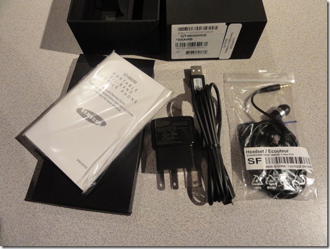
The Samsung Galaxy S Vibrant for Bell Mobility is the newest, and highest spec’d Android Phone in Canada, and I have it.  The Galaxy S has some of the best specs that can be found in the mobile market right now.  A 1GHz Hummingbird processor, a 4” Super AMOLED display with a 480x800 resolution, 512MB of ram, and 16GB of internal storage, which is divided about evenly between application storage and media storage. There is also a MicroSD card slot to accommodate an additional 32GB of storage.  There is a 5MP autofocus camera that takes 720p video, but sadly lacking flash.  The Galaxy S from Samsung is actually a line of phones.  The Bell variant of the phone is based on the European version, which also means that it has a front facing camera, and looks different than the Galaxy S Vibrant released on T-Mobile in the USA. The phones at their core are the same, with several small differences.  The phone is almost completely devoid of physical buttons.  Only a power/standby, volume rocker, and home button are mechanical. The back and menu buttons are capacitive touch, and while are easy to press and find are not 100% responsive, though that is partly android’s fault.  There is a 3.5mm jack on top as well as a MicroUSB port, which is covered not by a rubber or plastic flap but actually a sliding door, which is frankly genius and I’m amazed no one has thought of this method before.  Under the battery cover is the afore mentioned MicroSD slot, the SIM card, and a 1500 maH battery.  I’m not a huge fan of having the microSD slot under the battery cover, but with 16GB on board I don’t even have one in right now, and unlike some phones you don’t have to remove the battery to get at the slot, so it’s not terrible. The phone comes with the basic accessories.  A USB cable, power adapter (that you plug the USB cable into), a stereo headset that surprisingly doesn’t suck, and a small quick start guide and warranty info.

DSC01386

To be frank, the Galaxy S is the best phone I have ever held and used.  I haven’t used an iPhone 4 yet, or one of the 4.3” phones (droid X and Evo 4G) that are currently US only.  The Galaxy S is very thin, thanks to the Super AMOLED display, which is 50% thinner than the previous generation.  That makes the phone, while large in the hand, still feel very small, which is appreciated.  The display itself is simply stunning.  Colours are extremely bright and vibrant, to the point where they almost pop out of the screen.  Video looks amazing, and I have watched several movies on the screen and am very impressed.  The screen is visible, if not stellar in direct sunlight. It’s certainly good enough to make a phone call, but I wouldn’t try to read a novel.

This phone is, in a word, fast.  That is largely thanks to it’s 1 GHz processor.  It is leaps and bounds beyond any phone I have ever used, including the Palm Pre, and the BlackBerry Tour 9630 I currently use for work.  In my limited experience using an iPhone 3GS, I can say that the Galaxy S is faster than that as well.  Apps launch nearly instantly, I encountered very little slowdown, and the phone was able to do everything I threw at it, including some gaming, without breaking much of a sweat at all.  When I stop and think about it it really blows my mind where technology is at.  The first computer I ever used at school had a 90 MHz Pentium processor, and 800MB HDD, and 32MB of ram.  the first computer my parents purchased was a Pentium Pro 200MHz with 32MB of ram and 4GB of storage.  Now I hold a phone in my pocket that surpasses that in every way, and then some.

DSC01396[5]

the Galaxy S currently runs Android 2.1 with Samsung’s TouchWiz 3.0 interface on top.  This is my first experience with Android, and I have never played with a stock install of Android, so I can’t really compare it to stock, but overall I do like Samsung’s interface on the phone.  It is plainly obvious that they went for an iPhone clone look, and it works well enough.  Instead of only a phone icon and app launcher on the bottom, there is a “home row” of icons like the iPhone, as well as the app directory, instead of being a vertical scrolling list, is a grid screen of 4x4 icons that scroll horizontally, just like the iPhone.  While it’s not a bad thing, I just wish the cloning wasn’t so obvious.  The home row of icons comes by default from left to right as Phone, messaging, contacts, and an “applications” button that brings up the application list.  The Phone and applications buttons are not customizable, but the messaging and contacts are.  I replaced the contacts icon with Twidroyd, my twitter client.  I completely understand making the app button static, but I really wish I could move the phone icon off the home row, as I rarely use the device to actually make calls.

On the Galaxy S I have 7 home screens, with the “main” screen being on the far left.  I wish I could make that the middle screen, but there doesn’t appear to be a way to do so.  I’m still learning how to mix having widgets and app shortcuts on my home screen, and while I do enjoy having a few widgets, am trying not to go overboard with them.  for example, I have a widget for Twidroyd that lets me put in a quit tweet, as well as one touch access to doing a twitter search, but I find myself out of habit opening the app normally first.  I figure I’ll either get used to having a widget for that or eventually just remove the widget altogether.  Overall I am very impressed with Android.  When comparing it to WebOS, I would put them about par.  WebOS handles multi-tasking and notifications better, but Android I believe overall has more customization options and features.  Samsung has said that a update to Android 2.2 is coming in September for all Galaxy S phones, I hope Bell is on board with that.  There are custom ROM’s floating around with 2.2 for the Galaxy S already, though I haven’t taken that leap yet.

The last comment I want to make software wise has to do with the Android Market.  the WebOS app catalog, as of a week ago when my pre died, had about 2500 apps available.  I was mostly happy with what was there, and about 80% of what I wanted was available, so I didn’t’ care so much.  After a week looking through the android store, I can say that the difference is night and day.  Not only are all the apps I was missing on WebOS there, there are even more I never even thought of.  I’m really enjoying discovering new functional apps and using my phone in ways I frankly couldn’t with WebOS.

New app discovery is also probably my biggest pain point with the Android Market though.  Unless you know exactly what you are searching for, looking through the directory is painful.  I imagine this was manageable when there were only a few thousand apps, but now that there are 70,000+, finding something that it outside of the top 50 in any category, or something not brand new, is very hard.  I hope that Google eventually addresses that issue.

That being said, this is still one of the best phones on the market, and in my opinion the best phone on Bell right now, unless you are really hell bent on getting an iPhone.  My opinion is that if you want an iPhone, you’ll end up with that.  And if you don’t, the Samsung Galaxy S Vibrant is the best phone that money can buy in Canada right now.  With Bell recently discontinuing the HTC Legend it is quite frankly a no brainer.  The closest competitors to the Galaxy S are the Motorola Milestone on Telus (already nearly a year old however, and the successor is already out in the USA), and the Xperia X10 on Rogers, which, while similarly spec’d, is only running Android 1.6 and it is not clear if Sony will be upgrading it to 2.1.  The X10 also lacks Multitouch.  Rumours are flying that Rogers will be releasing a version of the Galaxy S similar to the Captivate model on AT&T in the USA soon, but until then the Galaxy S Vibrant is simply without peer in Canada.

DSC01391

Should you buy this phone?  In a word, yes.  It is that good.  Unless you really want an iPhone, or really don’t want to switch to Bell, the Galaxy S Vibrant is the phone to get in Canada.  If you are on Rogers and can wait a few more weeks, you’ll likely soon have your own Galaxy S option, and Telus right now does not have anything on the radar to match.  If you want the best phone today, this is the phone to get.

You can find more pictures of the Galaxy S Vibrant here.

You can see examples of pictures taken with the Galaxy S here, and here. Note that the low light photos are not fantastic, and I have taken some very good pictures with it, just none that I was able to put on flickr at time of publish

An example of a 720p video taken with the Galaxy S can be found here.

MacBook Pro - One year later

It has been about a year since I bought my first Apple Computer, a 13” MacBook Pro.  You can read my review here, and see my unboxing here.  What I want to do is revisit the MacBook Pro, and talk about my first year with it. First, the hardware.  I can say that even a year later the MBP is the best quality computer I have ever handled. It still feels solid, the hinge is still as good as it was when I first opened it, and nothing adverse has happened to the machine.  The build quality is seriously top notch, and I know that this computer will still be rocking like a tank long past it’s useful lifetime as an actual day to day computer.  The Battery life was advertised from Apple to be 7 hours.  When I first got the computer, under ideal circumstances I could get very close to that 7 hours, though around 6 was more realistic.  1 year later, and the battery is starting to degrade just a little bit, but nothing like other laptop batteries I have seen.  It does vary depending on use, but I am averaging around 5 hours of battery life, which is still very good, and battery life is rarely an issue for me.  A quick look at coconutbattery tells me I have discharged the battery about 175 times in the past year.

That being said, there are a couple of things I really wish the MBP had.  The screen resolution on my MBP is 1280x800, which is pretty low, even by 2009 standards.  Many 13” laptops come with 1366x768 displays now, which are capable of displaying 720p video full size.  Even the 2010 revision of the 13” MBP still only has a 1280x800 display.  This is one area where Apple really needs to step it up and catch up to it’s PC counterparts.  The other issue I have is with the limited USB ports on the computer. the 13” MBP only has 2 USB ports, and they are very close together.  For example, if I plug in my cruzer micro 16GB flash drive, it blocks the second USB port and I cannot use it.  the Cruzer Micro, despite it’s name, is not the smallest flash drive on the market, but it is definitely not large.  The casing is only about 1cm wider than the width of a USB port.  Apple really does need to space the USB ports out just a bit more.  I’d also really, really like a 3rd USB port.  9” netbooks have 3 USB ports, Apple really should put a 3rd USB port in.  There have been a few times where I really could have used it.

When it comes to the software side, I was really jumping into a new world. Sure, I’ve used OS X in the past, spent a couple semesters using Apple computers in school.  But beyond that, it was really my first foray into OS X.  I didn’t know much about the 3rd party software, and within a month of my computer purchase, OS X 10.6 Snow Leopard was released.

Long story Short, Snow Leopard is miles better than Windows XP, but that shouldn't be surprising, since Snow Leopard was released in 2009 and Windows XP was released in 2001.  Snow Leopard is also better than Windows Vista, but not by as much as people might think.  I’ve talked a lot about Windows Vista here, and won’t really rehash that.  Is Snow Leopard better than Windows 7?  No, it’s not.  Is Windows 7 better than Snow Leopard? The answer to that is also a no.  After a year of using both operating systems on a daily basis, I can honestly say that for the most part, they are pretty much comparable.  Sure, there are some things that Snow Leopard does better than Windows 7, and some things that Windows 7 does better than Snow Leopard, but at the end of the day, they are very comparable experiences.  I very much enjoy using Snow Leopard, but if someone took my MacBook Pro away from me and told me I had to use a Windows 7 laptop instead, I could do that without missing a step.  One of the main reasons I purchased an Apple laptop when I did is because I wanted to become proficient in both Windows ans OS X.  I am still better with Windows, I probably always will be, but I can also now switch between operating system environments without missing anything, or feeling like I’m lost, which really means that my goal has been accomplished.

One thing that I really have noticed in my time using both Windows and OS X, is that for probably 70% of what I do on a day to day basis, the platform I use doesn’t really matter.  Most of what I do regularily lives on the web. I use the gmail web interface, google docs, Facebook, and many more web applications.  I use desktop applications all the time as well, but some of them are even cross platform.  For the apps that aren’t, there are always equivalents on both platforms, and I have learned how to use most of them.  One of the only things I do now that I make a point of doing windows only is working with photos and videos, but the main reason for that is because my desktop computer is much more powerful and has much more screen space than my MacBook Pro.

The only applications I can honestly say that I was disappointed with has been the iWork suite.  Not so say the software itself isn’t good, but the fact that I work with word and excel documents all the time, and while Pages and Numbers support opening them, it is very hard to quickly work with and save .doc, .docx, .xls, and .xlsx files.  that was what actually finally pushed me to use google docs nearly full time.  I’m looking forward to trying Office 2011 for Mac, as I really do enjoy using the traditional Office suite.

Beyond that there really isn’t a whole bunch to say.  I love my MacBook Pro dearly, and really do think it is a wonderful computer, despite it’s few shortcomings.  Perhaps the biggest thing I have learned in the past year of using both platforms is that at the end of the day it really doesn’t matter what platform we use anymore.  Windows and OS X are each other’s peers, there is not one that is better than another, and so many people use the web so much now, that it truly doesn’t matter.  I know this is a tired argument, but I firmly believe that apple could hit a better market share if they simply lowered the price of their computers, but considering they just came out with their best quarter in the company’s history, I don’t see that happening.

Would I recommend an Apple Computer today?  Honestly, it’s not really a yes or a no answer.  If you are willing to spend more money for the computer, and don’t mind a couple weeks of a learning curve, by all means, go ahead.  But for most people, you don’t need to.  There will always be people who will buy only Apple Computers, and there is no problem with that.  If you really want to buy it, you will buy it.  If you don’t, I really don’t think anyone will miss a beat using Windows anymore.  Go with what you want, and what you are comfortable with.  You won’t be disappointed either way.