When it comes to my technology products, in the last several years, I have used most desktop and mobile platforms, except for Apple’s. I have had a couple MacBook laptops, but haven’t used an Apple product as a daily device since around 2015. That changed earlier this year when, frustrated with the overall state of the Android ecosystem on tablets, I purchased an iPad Air. It became my first iOS/iPad OS product since the very first iPod Touch, and the first Apple Product that I’ve used personally in several years. I really wanted to re-familiarize myself with Apple products, and for what I was looking for, an iPad made the most sense. Learning iPad OS has been a fascinating experience, and I have a lot to say.
Now, this doesn’t mean I’m completely unaware of how iOS works, or how to use it. I’m a tech enthusiast, and I follow the industry closely, including Apple products. And I have people in my life who use Apple products that in inevitably end up supporting. So I would be lying if I tried to say that I was going into this blind. But I haven’t used an apple iPhone or iPad as a daily device until now. I’ve been using the iPad air for a few months now, and boy do I have some thoughts.
First off, I’m using an iPad Air 3rd generation, which originally released in 2019. The device I have has 64GB of storage, and when I bought it, I also purchased the Apple Smart Keyboard Folio. I have since also purchased an Apple Pencil, and a trackpad to use and test mouse support. As of this writing, most of my time with the iPad was spent on iPad OS 13.4, and it was updated to iPad OS 13.5 since. I’ve been sitting on this one for a while, with more topical things to write recently, so most of this review was written before the announcement of iOS 14 and iPad OS 14.
Home screen and Widgets

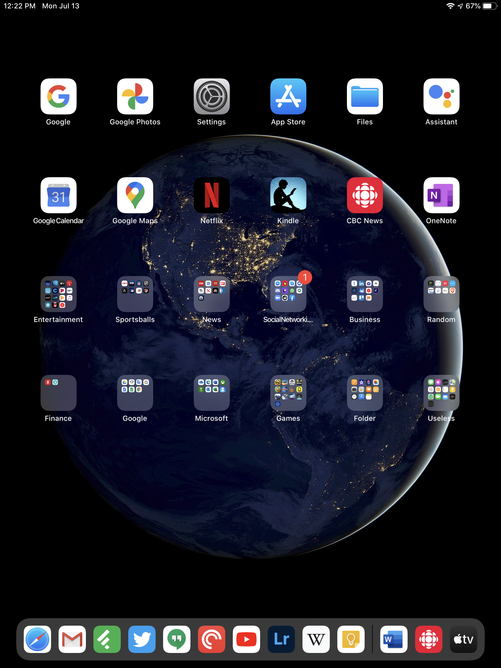
My iPad’s home screen
After a few months of use, I find the home screen one of the weakest aspects on the iPad. The “grid of icons” that has persisted almost entirely unchanged from 2007 feels really limiting to me. On an iPad specifically, it feels like a bunch of wasted space. Icons are spread so far apart that you could easily double the number of them on every screen and still not feel cramped. The only mitigation to this is the ability to pin the today view widgets to the left side of the screen in landscape mode, which increases both the usefulness of the widgets, and makes the home screen feel more complete. In portrait mode, this is not available.
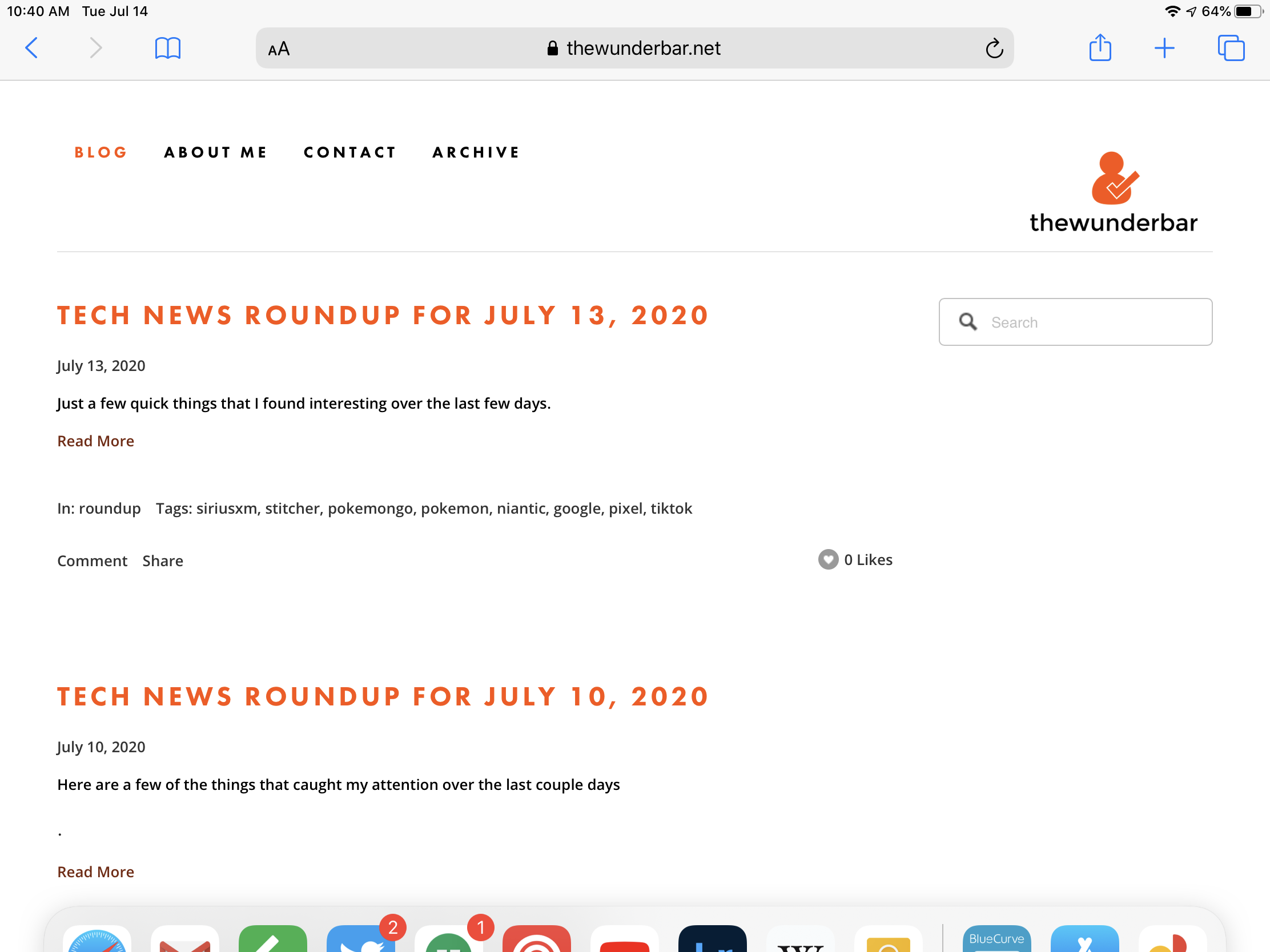
iPad home screen, portrait orientation
Because there is no separate app drawer like there is on Android, I use folders extensively on my iPad, including the almost necessary folder named “useless” for apps that I will never use but can’t delete. iOS 14 promises to really help that situation on iPhone, but those improvements are not coming to the iPad.

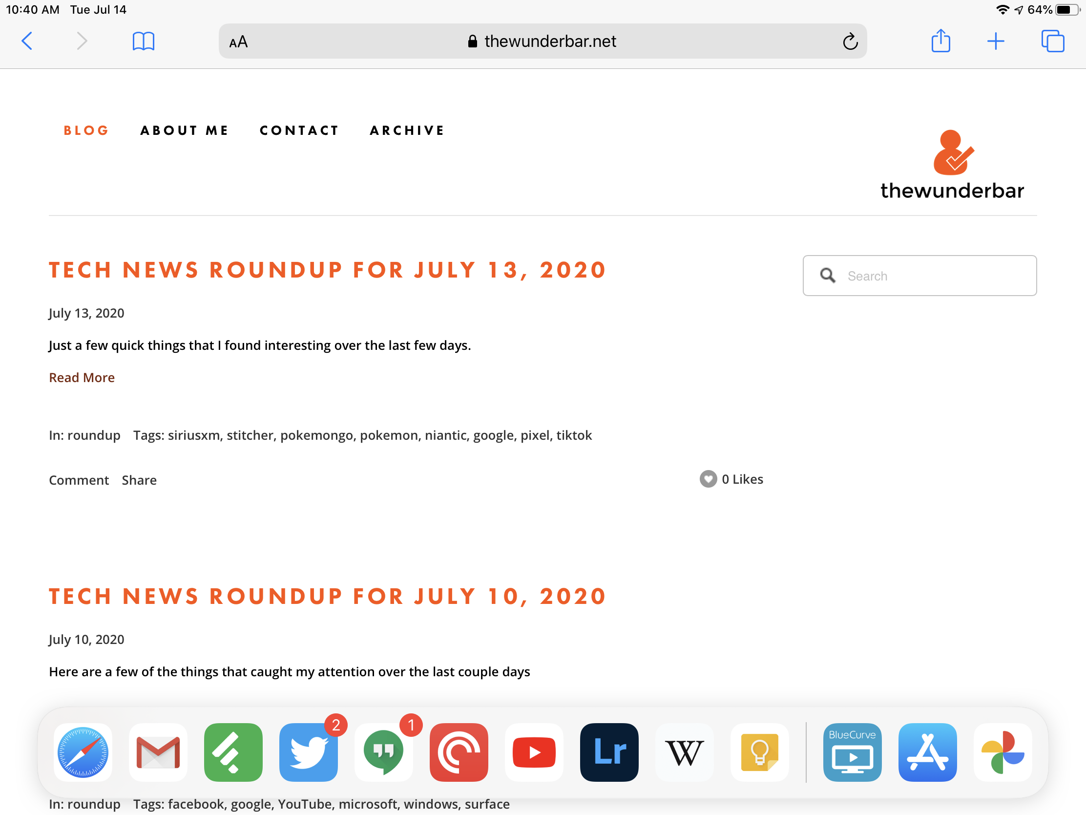
I have folders named Ramdon, Folder, and Useless, because I have nowhere else to put some apps
Widgets on the platform are a decent step. They are somehow simultaneously better than android widgets, and worse than android widgets. They are better because they do have a mostly uniform look and feel more at home in the system. Widgets on Android are a wild west of various shapes, sizes, and designs that all look different. I rarely use widgets on Android anymore because since the quality varies so much, I usually don’t bother. On my iPad, I use them because they at least look consistent, even if the usefulness of them varies greatly.

The Today view widget list on an iPad in portrait mode, accessed via a swipe from the left edge of the screen
They are worse than Android because by default they are hidden away to the left of the first home screen, and the functionality is somewhat limited. The limited functionality is a design choice by Apple, and does help some widgets more than others. Google Calendar for example, displays a list of upcoming events, which is very useful, but there is no way to create an event from the widget. But the real limitation is the fact that they are hidden by default. You have to remember to go look at them. This is mitigated with the option of pinning the widget list in landscape mode. This makes widgets infinitely more useful to me, and makes them something I interact with regularly. iOS 14 will bring further widget improvements, but just like the home screen improvements, iPad OS will only get a subset of the new features.
Navigation and Gestures
Navigating an iPad, especially an iPad Air that retains the home button, is an interesting experience. It can (almost) as complicated as I want, to the point where it can be too complicated for the limitations of the system. It can also be almost dead simple. I think overall the navigation of an iPad is a great strength, but the lack of discoverability of all the capability really hurts.
At its simplest, you can open an app by tapping the icon on the home screen, and when you’re done, hit the home button to go back. You can do anything you want to do on an iPad just with that, and the simplicity there is very refreshing. This makes the device accessible to almost anyone. But dig deeper, and there is so much more.
Anyone who has an iPhone or iPad without a home button is familiar with at least some of the gestures supported in iOS, specifically swiping up from the bottom to go to the home screen, analogous to hitting the home button. But the gestures in iOS and iPad OS are generally powerful, but largely not discoverable. The one really interesting thing is that every iPad gesture works on iPads with home buttons. This not true on iPhones, where an iPhone with a home button still has control center as a swipe from he bottom. But on iPad, the full gesture library is supported.
Some of these gestures are relatively easy to find. Swiping up from the bottom takes you home, but there are literally two other swipe up gestures. Swipe up just a few centimeters from the bottom, and it will bring up the dock, swipe up from the bottom but hold your finger for a second or two before releasing, and you get the recent apps view. That is three different results from doing the same action, some which you will do accidentally on occasion. Accidental activation of one of those gestures at least aids in discoverability, but not so much for usability.
Other gestures are even less discoverable, but useful. Using three fingers on the screen, you can swipe left or right to switch between apps. This mirrors the same gesture on Mac trackpads (and works on a trackpad on iPad), but unless you know it is there, that is not likely a gesture anyone would discover on their own. There is even a gesture where with all 5 fingers and your thumb, you can “pinch” an app closed, returning to the home screen. I use this one quite a bit, even if it isn’t the most useful feature.
Other useful gestures include swiping down from the top of the screen to bring down notifications, though that is frustratingly full screen, and a swipe down from the top right corner for control center. Again, two similar gestures that do two different things. Easy once you figure it out, but frustrating that it isn’t more obvious. The last gesture I use regularly is a swipe in from the left or right to get a slide over app, which I’ll talk more about when I talk multitasking.
There are other gestures which I never use, like the ability to so a 3 finger “pinch” gesture to copy text, and a 3 finger… un-pinch? to paste. This sounds useful at times, but I never use it. I’m sure there are a few others that exist that I never use, because I don’t know them and will never find them organically.
When it comes to the gestures and navigation, I think my feelings are obvious. I think actually navigating around an iPad is a pretty great experience, but I am frustrated that many of the better ways to move around the system are not very discoverable, and Apple doesn’t really help users with that, aside from a quick intro when an iPad is first set up.
Multitasking

The ultimate in iPad multitasking. You should never do this, but you *can.*
iPad OS supports the ability to multitask, but not in the same way as a traditional MacOS or Windows computer. Two apps can be run side by side, there is a feature called slide over that allows an app to be in a small window on top of another app, and video apps can support picture in picture, with a video playing in a small window overtop of another app, or the home screen. Multitasking is more limited than on a Mac or PC due to iPad OS’s restrictions. In general, I find those limitations acceptable, though anyone attempting to use an iPad to replace a laptop will likely run into restrictions that require a change in workflow. And, as is generally the case, the multitasking features are relatively powerful for a mobile device, but difficult to discover.
Activating iPad multitasking. Bringing up the dock, and dragging an app to the side, or the middle
To use multitasking, the app icon must be visible in the dock. Up to 13 apps can be pinned to the dock, and the dock will also display the last three apps that have been opened used that are not pinned. To get two apps side by side, users must swipe up just a bit from the bottom to reveal the dock, then drag the app icon to either the far left or far right side of the screen. This will spit the two apps 50/50 on the screen when the device in in landscape. The black bar in the middle of the two apps can be dragged either way, and then the apps can be divided 75/25. Dragging the black bar all the way to either side will close one of the apps. When holding the device in portrait mode the screen is divided into one third and two thirds, with no option for 50.50. I find it particularly useful to have a video playing app like YouTube on one side, with something like Twitter or Safari on the other. For productivity, something like Microsoft word split with a notes app, or a web browser does make sense.
Various states and types of iPad multitasking
Slide over is another useful tool to have an app that “floats” over the main app and can be called or dismissed with swipes in and out from either the left or right of the screen. I use this all the time for media apps like podcasts or music, or something like Twitter. I don’t always need to see them, but they are there if I need them quickly. Slide over also works like it is an iPhone within the iPad. Slide over has its own app switcher like an iPhone, and multiple apps that are being used in slide over can be switched between within the slide over window independently of the rest of the iPad. It is super powerful, super complicated, and one of my favorite weird features of multi tasking.

Multitasking within multitasking with the slide over app switcher
Picture in Picture is self-explanatory and allows a small video window to be over another app to allow video to keep playing.
The Multitasking Limit
The two things I find frustrating about multitasking on an iPad are the limitations of iPad OS itself, and limitations from apps. The limitations from iPad OS itself are mostly understandable, but for me personally, the iPad can’t yet completely replace a laptop. For what it is, the feature set is good, but if you are used to having three or 4 things open and visible at all times, split screen can be limiting. On a smaller screen device like an iPad, this is less of an issue, but I will point out that when I hold the iPad Air landscape, the screen is about as tall as my XPS 13 laptop, but narrower. I think that as iPad OS matures, and Apple continues the moves to streamline the experience between MacOS and iPad OS, some of these limitations will disappear, but I still think that the future of the iPad line vs the future of the Mac line will be that separation of a device that can truly multi-task compared to a device where it is really geared towards doing one thing at a time.
App support for multi-tasking is even more frustrating, however. A developer has to enable support for multitasking in an app, and the patchwork of support makes it very hard to be able to rely on it. Some apps support multitasking fully, others not at all, others have unfortunate limitations that feel arbitrary. Picture in picture support is most glaring at this. There is little reason for a video app not to support that feature, but in my use, I found that there are a number of apps that do not. Split screen support is also missing from apps on an arbitrary basis. If Apple required every app to support multitasking, it would go a long way to solving some of the frustrations with the system. Until then, it remains trail and error on discovering which apps support which features. When I first got the iPad, Gmail did not support multitasking at all, which was hugely frustrating. But Google added in an app update a few weeks ago. Most of these multitasking features originally debuted with iOS 9 in 2015. The fact that apps still do not support it is exceedingly difficult to understand.
More to come
There is a lot more to talk about with iPad OS. Notifications, Mouse and Keyboard support, the Apple Pencil, How the system handles apps and settings, managing files, and more. Next week I’ll have the second part of this review that covers even more.